Tuesday 15 March 2011

Final Poster

To create this I pasted the same image into my text and then played around with the placement of the text until you could see all of the letters against the background...which took at lot of editing and frustration!
I am really pleased with my final piece. I love the image that i have used and think its overall look is very professional.

Friday 11 March 2011

Final 3D Piece!

Short video of my final piece spinning...bit wobbly as i was trying to blow it round as i recorded!


Really pleased with how my final piece has turned out. I like how it catches the light and produces shadow as it spins. Went for a main peice hanging down the middle with various sized smaller pieces hanging at different heights from the metal ring. Really like the individual shapes of each piece and how they work together to create an overall shape.

Was really tricky consructing my piece. The main problem was trying to attch the metal ring so it hung level with the main piece central. Spent quite a while messing with the lengths of fishing wire to get it level. Ended up having to hang it from the light fitting in my living room to put it all together...sure my mum loved me for that!

(in the process)

All so had problems photographing it as it tends to slowly spin on its own...so i'd just get a shot that i liked and by the time pressed the shutter it had moved! Highly annoying!
Overall i think my final piece is a goood outcome to all my experimenting and preperation work and i think it works well with my idea of repeating waves.

Wednesday 9 March 2011

Poster ideas and research

So even though I haven't finish my final 3d paper model yet i have decided to start thinking about by poster design. I have looked at a few previous posters that GF Smith have used to draw inspiration.


These are a few examples I have found. The first two interest me most visually. I really like the ink in water posters i think they are visually exciting and interesting to look at. I also like how imagery has been combined with the text in the union jack example.

I started to look through the images i had taken of models i had made so far and thought that close up images are probably goin to work best. They wont crowd the poster with to much to look at but fill it with something interesting to look at. I decided to make a large pleated piece as i thought i would be able to get better close up shots from a larger piece.
These are a couple of the best shots I took. I have edited the brightness and contrast on these images using photoshop to enhance the lighting and shadows.


I think both these images have potential to make a visually interesting and eye catching poster.

Final ideas

I've decided that the method with the best results for me has been pleating the paper to create a twisted form. I think this really interprets the shape of a wave and is individually very nice to look at. I have thought about various ways of displaying these sculptures and i think they will look at their best when hung. I decided to research into chandeliers that have been made out of paper and how they have been arranged to look at their best when hung.


I think this is probably a pretty simple design but it looks really effective mainly due to the lighting that has been used. I think this is a really important factor i need to think about when displaying and photographing my final piece.

This piece looks as though it has been hung from a main ring structure that is hidden under the paper. This means the majority of the paper is left to hang naturally.

These pieces look really complex which makes them facinating to look at anyway but i really like the way they are hung low to the floor.

This has been hung to create quite a traditional chandelier shape but each paper cut out has been individually hung. This makes it very busy to look at but creates some amazing shapes.

The reason this one caught my eye is the way each model has been made at a different size and hung at a different level. I think this would work really well with the models i am planning to create.

The shape of this one really caught my eye and how it had actually been used as a lamp shade and lit from within. I think the lighting really expresses the shape of the model and creates interesting shadows.


I then decided to look at chandeliers that wern't made out of paper but used the same shapes that i am planning to use.

All three of these show glass chandeliers that have used a similar shape to that i will use for my final piece. All three of them are arranged and presented in very different ways. I really like the shape created in the middle one and how third one has been seperated into three sections.

So not as easy as it sounds!

So i tried out the wet folding technique and found it is A LOT harder than i thought.
I think the main problem was that i had my heart set on being able to produce something as amazing as Richard Sweeney. This didn't really go as hoped! Even after experimenting with several models i couldn't create the shapes i was hoping for. Richard Sweeney obviously has a secret ingredient he's just not letting out! Here are a couple of my best attempts...


This was using the pleated technique. I managed to put one curve into it but the rest of it kind of flopped!

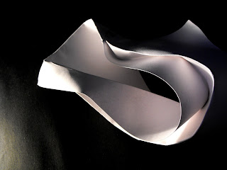
This time i tried a different technique of scoring curved lines in the paper and folding along these lines. I originally wanted the paper to stay curved itself but i couldnt get it to stay in place so i pulled it round so both ends met and joined it with tape.

Wet Folding!

I was intrigued how Richard Sweeney created such curved and fluent shapes in his pleated models. I found that he actually used a technique called wet folding where you fold the paper whilst it is damp. This makes the paper much more flexible and lets you easily form curved surfaces. When the paper dries it keeps it's shape, becoming rigid. I researched into the technique and how it works. Its a pretty basic technique but is quite tricky to get right. The paper needs to be moistened used a damp cloth. Get the right amount of water on the paper is the tricky part. Getting it too wet means it will start to tear and fall apart, not getting it wet enough means it will dry to quickly and basically it won't work. All in all doesnt sound too complicated....so i gave it a go!

Further Experimentation!

After seeing potential in my screwed up off cuts i decided to expand on this idea in a more planned and structural way. I used a similar technique to my initial ideas using strips and slots but arranged them to look more tangled and messy.


I think this would look really interesting on a larger scale. Maybe using several pieces connect to create a sphere of tangle.

I also decided to try a very different technique using strips to make a pop up style model.


I varied where the triangles hit a point so that it created a curve along the page.